
First Aid for Human Rights
A human rights platform designed for clarity, trust, and speed.
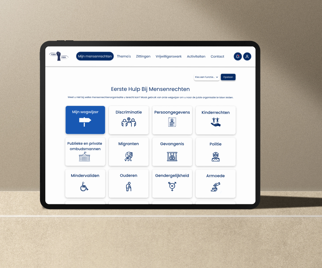
The problem
Human rights are often difficult to navigate. The information is complex, support systems are unclear, and the number of organizations can be overwhelming. Many people don’t know where to turn when they need help most. We conducted user research, including interviews and surveys with potential users, to identify their pain points and challenges when accessing human rights information. This phase allowed us to step into the users' shoes and understand their real-world needs.
User personas: To further guide our design, we developed personas representing key user groups. These personas helped us empathize with the needs, goals, and challenges of our target users. They played a crucial role in shaping the user experience and ensuring we addressed real user pain points.


Concepting
Once we had a clear understanding of the problem and the users’ needs, we began shaping the concept for the
platform. Our goal was to create an experience that would empower users to easily find human rights
information, without feeling overwhelmed or lost.
We brainstormed features and user flows that would make navigation intuitive: a simple website with clear
categories, an AI guide for users who needed extra help, and a way to highlight actionable resources like
volunteering, events, and support contacts.
Through iterative sketching and discussions, we refined the concept into a user-centered platform that
prioritizes clarity, accessibility, and trust.
User flow
To visualize how users would interact with the platform, we created a flowchart outlining the key paths through the website. This helped us ensure that every user, whether registered or browsing as a guest would be able to quickly find the right information or support.
Download User Flowchart (PDF)Visual Design
With the structure and flow validated, we focused on creating a visual identity that would reflect the platform’s goals: clarity, trustworthiness, and accessibility. It was important to maintain a visual connection with the existing FIRM branding, while making the interface approachable for a wide audience.
We refined the color palette based on FIRM’s colors, selected accessible typography, and designed a clean, consistent UI. The logo was crafted to balance official tone with clarity, and we paid special attention to visual hierarchy and spacing to support readability.
Color palette
#062B65
#0047AB
#7FA2D4
#EFF0F1
#FDFDFD
Logo & Favicon
 Logo
Logo
 Favicon
Wireframing
After defining the core concept, we moved on to wireframing. In this phase, we translated our ideas into structured layouts and interaction patterns.
Our goal was to ensure a seamless and intuitive user experience. We created low- and mid-fidelity wireframes to explore different layouts and refine the information hierarchy. These wireframes also helped us validate our navigation flow and interaction design before moving on to visual design.
Homepage Wireframe


User Testing
To ensure our platform truly supported users, we conducted multiple user tests with people from different backgrounds, including young adults, newcomers, and individuals with prior experience navigating human rights issues.
These sessions revealed valuable insights: users appreciated simplicity, guidance, and clarity. Based on their feedback, we refined navigation elements, added contextual help, and made the homepage more action-oriented.
This phase helped us turn assumptions into improvements, ensuring the experience was intuitive and empowering.
Development
To build our platform, we used a mix of web tools that worked well together. We wrote the structure in HTML, styled everything with CSS, made it interactive with JavaScript, handled data using PHP, and stored everything in a MySQL database.
Every part of the site was designed to be fast, clear, and easy to use on any device. We kept things clean and organized so users could focus on what really matters: their rights.



What I Learned
This project taught me how to design with empathy. I learned how to translate a real complex issue and sensitive information into clear, visual, and human-centered experiences, without compromising accuracy.
Working with a real-world partner like FIRM challenged me to balance user needs with institutional requirements. From research and wireframing to coding and testing, every phase pushed me to grow as a designer and a problem solver.
I’m proud of how we created a platform that not only informs but also empowers people to take action for their rights. It’s a reminder that design can make a real difference in people’s lives.